Showing posts with label critique. Show all posts
Showing posts with label critique. Show all posts
Thursday, 3 April 2014
Binding
I've begun printing my booklet for test binding. I'm very comfortable with printing booklets from inDesign. Using short-edge binding and the 'Print Booklet' functionality. I've brought some high 230gsm paper (non-gloss) to print my final brochure on. I first printed the booklet and used a strip of book-binding glue to glue the booklet together. This proved not very good and ended up ripping the ink/paper away from itself and didn't work at all. My fall-back plan is to stitch my final booklet which will have less of an affect on the booklets finished aesthetic and will add to the kitchy/nic-nak/collective aesthetic of the booklet.

Tuesday, 18 March 2014
Laundry development example
I have a really rapid way of working and it's difficult for me to record developments and process when I'm so focussed on designing and creating something awesome. I've taken a few screenshots throughout the process. Showing how I moved around and created new illustrations to fill the space. It was very much like working with a jig saw puzzle making sure there wasn't too much white space while keeping things equally spaced. Here is my work on Laundry over time...


Sunday, 16 March 2014
Title typography
I've laid out my illustrations on each page and now need to think about Typography. I've download a bunch of different fonts and tried each Bar name in the fonts. I want to stick with a font that's quite simple and not too distracting from what could be an already quite busy spread. It's because of this I automatically favour the sans-serif fonts and I quite like the idea of a slab sans-serif in all caps which creates a very blocky amount of text emphasising the clean lines of the illustration style and allows me to carefully slot illustrated items around the block of text, without bits of white spaces for the non-cap letters and serif ligatures. I've attached my test sheets for my fonts. I've chosen the font 'Franchise' which is bottom-right in each sample.


Wednesday, 12 March 2014
Furniture selection and illustration
Before I put all the objects into the layout I first illustrated them based on the imagery I found online that was dictated by the mood boards. It was important to make sure I based the illustrations heavily on reality to ensure that the scale and believability of them was good. Some of the photos I've illustrated as closely as possible, and others I've used creative freedom to slightly alter. The colours have been dictated by the colour palletes I explored earlier and I've tried to use colours that are realistic for fabrics/materials to maintain a reality that the illustration kind of betrays.


Monday, 10 March 2014
Sketching out the initial layouts
During class today I had the mood boards in front of my and I sketched out some ideas for how I might like to lay out my pages. I want to create a central horizon line that will be present throughout all three layouts so that's where all my furniture/decorations will sit. Apart from a few hanging things to even out the vertical space. I've attached my (very messy) sketches. Had to attempt southern cross twice. Was quite tricky and at this stage I'm not sure the elements will balance nicely.


Saturday, 8 March 2014
Moodboards and illustrative influence
Having sourced photographs for each place I search on furniture/interior design websites as well as Google images to find good pieces of furniture and design that I think would suit each of the bars. As I was illustrating based from these photos I don't need to worry about copyright as everything is recreated from scratch. The Southern Cross bar has proven to be quite difficult because there isn't really a single clear aesthetic, it has several different feelings throughout. So in order to further disconnect it from the other bars I've chosen the aspects of Southern Cross that are least like the other two bars. I wanted to make sure I was illustrating from 'signature'/recognisable furniture pieces and didn't necessarily want to specifically illustrate the exact objects that could be found in the bars. This abstracting of the illustrations gives a higher level of creative freedom in creating a seamless illustration piece, as well as generalising the furniture to help the reader recognise more easily the aesthetic I am portraying in each.
I've attached my mood boards for each: Laundry, Olive and Southern Cross


I've attached my mood boards for each: Laundry, Olive and Southern Cross
Tuesday, 4 March 2014
Icons/Index
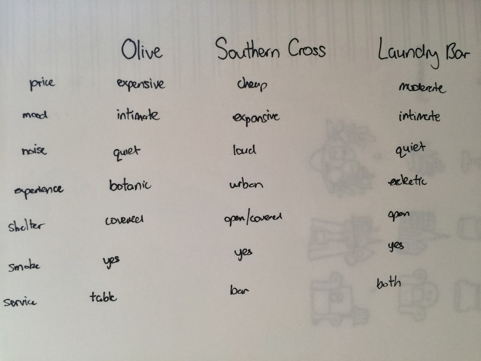
After narrowing my selection to be: Olive garden, Southern Cross and Laundry bar I explored ways to represent each through icon, index and symbol. In doing so I was able to better understand the differences and it sparked the beginning of how I can visually differentiate the three bar areas. This index/icon work is below.

Garden bars.


Finally the finished result was a chart that allowed me to select the aspects of difference that I want to expose/promote in my brochure.
Subscribe to:
Posts (Atom)