
Showing posts with label define. Show all posts
Showing posts with label define. Show all posts
Sunday, 16 March 2014
Map developments
Having been inspired by the London underground line based map which places emphasis on readability rather than geographical correctness and wider context. I decided that because my three bars are all on Cuba Street (Southern Cross is not on Cuba, but just around the corner) I could also simply the map to just include cuba street and those intersecting streets. Cuba street is probably Wellington's most iconic street so I don't think there's too much need to contextualise it to help people find where it is.

Friday, 7 March 2014
Examining the environment
I've collected and researched a little about each of my chosen bars. In creating a collection of photographs from each bar I have been able to get a clear feeling for the way that each bar feels and looks. And through grabbing these photos from google, online reviews, instagram and other curated sources, I've also gained a significant insight into what people look at and think is photo-worthy in each place. Which is probably a good indication of what things I could illustrate to represent each place. The time of day in the photos is also a good indication of the mood and when people might go to each bar. For instance Southern Cross is photographed predominantly at night, whilst Olive has a more even spread of photos taken during the day and evening.


Tuesday, 4 March 2014
Looking at colours
I started to explore different colour pallets that were inspired by my areas and taken from photographs of them. I've also been doing a lot of research towards different print graphic design styles and illustration styles.


Garden bars.


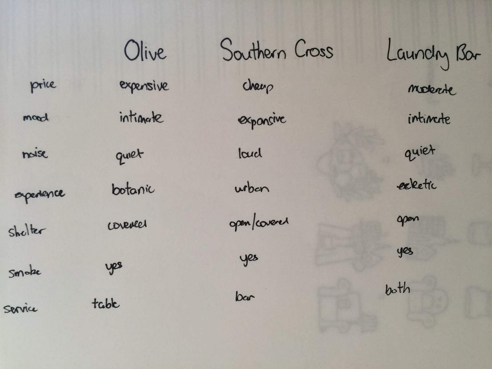
Finally the finished result was a chart that allowed me to select the aspects of difference that I want to expose/promote in my brochure.
Subscribe to:
Posts (Atom)